
Mobile-first HealthPost users struggle to find desired products through the current mobile navigation menu. The menu structure is confusing, causing users to miss out on key product categories. This leads to frustration, dissatisfaction, and ultimately hinders purchase completion.

Problem:
Mobile shoppers on HealthPost.co.nz, a leading
e-commerce platform for health and wellness products, struggle to navigate the product catalog efficiently due to a confusing mobile navigation menu.
This results in a poor user experience (UX) characterized by frustration and difficulty finding desired products. Consequently, low conversion rates indicate users abandoning their purchase journeys before completion.
Challenge
The project had to be rolled out and implemented in 4 weeks so there wasn't enough time for traditional research methods such as interviews and user testing. So I had to stick to quicker research methods to validate my design decisions and understand the pain points of the user.
Navigation Redesign Process

Empathise
To understand mobile user needs for product discovery, we conducted user interviews to uncover pain points with the current navigation (e.g., confusing structure, limited category visibility). We further analyzed user behavior data and post-purchase surveys to quantify navigation patterns and specific frustrations. Finally, heatmaps and recordings provided a visual understanding of user interactions, revealing areas of user difficulty. This multi-pronged research approach provided a holistic view of user needs, paving the way for a more intuitive mobile navigation experience.
DEFINE AND IDEATE
From Pain Points to Power Browsing: Rethinking HealthPost's Mobile Navigation
User research became our roadmap for revamping the mobile navigation. We wanted to ditch the confusing layout and make browsing a breeze. Think "easy-peasy" product discovery! Our other big goal? Highlighting those key categories and features – no more hiding the good stuff!
To brainstorm solutions, we got the whole team together for a throw-down session (think whiteboard markers and endless coffee).We explored different navigation styles, like those cool bottom bars you see on most apps these days, the classic hamburger menu, and even tabbed navigation. We also peeked at how our competitors were tackling navigation on their mobile sites – gotta learn from the best, right? Finally, we double-checked our ideas against the Baymard Institute's research, like the navigation gurus they are. This all-hands-on-deck approach, from user insights to competitor intel, set the stage for designing a mobile navigation that's both user-friendly and awesome.

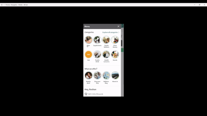
HealthPost Mobile navigation before redesign
Prototype
The research phase had laid the groundwork, and now it was time to translate those findings into an interactive experience. Here's where the prototyping process took center stage.
My journey began with crafting low-fidelity wireframes in Adobe XD. These wireframes prioritized clarity and simplicity, acting as visual representations of different navigation layouts and structures. Imagine basic shapes and labels – a stripped-down approach that focused solely on communicating the core navigation architecture.
With the foundational wireframes established, I transitioned to developing interactive prototypes. These prototypes offered a more realistic feel for how the navigation would function in the final product.
Finally, to broaden the decision-making process and foster team collaboration, I conducted a design thinking workshop. During this session, we presented multiple prototypes, each showcasing its unique approach to navigation. This collaborative environment allowed the entire team to participate in the selection process, ultimately choosing the navigation solution that best balanced user needs with business goals. Through this multi-faceted approach, we successfully evolved from research to a tested and refined navigation prototype, one that promised a more streamlined user experience for HealthPost customers.
Recording of the prototype created
Test
With a clear winner emerging from the design thinking workshop, the next step was to validate its effectiveness with a real user base. I meticulously defined success metrics and testing goals, ensuring a data-driven approach to evaluating the new navigation. We used Visual website optimizer(VWO) to conduct the A/B test, This allowed us to seamlessly integrate the new navigation prototype into the live site for a controlled experiment. A clear winner was identified with in two weeks based on the conversion rate and category page visits from the mobile navigation menu.

Develop and Deploy
With the navigation battle-tested and user-approved, it was time to bring it to life. I teamed up with the development crew to seamlessly integrate the final navigation design into the HealthPost web app.
But the journey wasn't over yet. Thorough quality assurance testing became our next mission, ensuring the redesigned navigation functioned flawlessly and delivered a smooth experience across various mobile devices.
Finally, with the launch complete, we weren't about to sit back and relax. User analytics became our compass, allowing us to track navigation usage patterns and user engagement metrics. This data would be our guiding light for future optimizations, ensuring the navigation continued to evolve and meet the ever-changing needs of HealthPost users.
